A brand identity for a Sussex-based heating company specialising in heat pump installation and low-carbon home energy solutions.
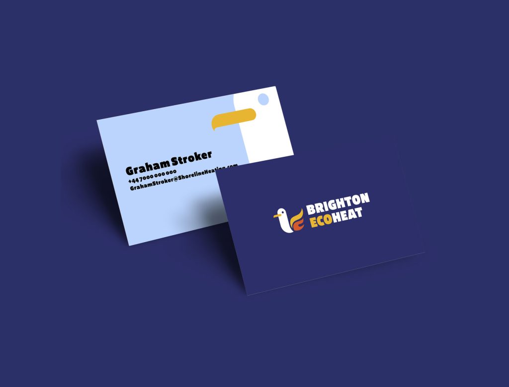
The brief called for something that felt local and approachable without leaning on tired heating industry clichés. The result pairs a stylised seagull, a nod to the Brighton seafront, with a flame motif integrated directly into the bird’s form, creating a single unified mark that communicates both place and purpose.
The colour palette brings together a deep navy, warm amber, and a terracotta orange, lending the brand energy and warmth while keeping it grounded. Bold, condensed sans-serif lettering reinforces the confidence of the mark, with “ECO” highlighted in amber to foreground the company’s green credentials.
The project was ultimately shelved when the client discovered a naming conflict with an existing company, but the identity demonstrates how strong conceptual thinking and local character can elevate a functional service brand into something genuinely distinctive.